
Making a very usable app, even more compassionate for various age groups!
Project Scope: 2 weeks
Project Type: Team “SWEE” assignment
Team Members: Gin & Gabriel
My Role: UX Research, UX Design, UI Design, Project Management
Tools: Paper Sketches, Miro, Google Survey Form, Google Slide, Figma
Trace Together is an app developed by GovTech and the Ministry of Health, to facilitate contact tracing efforts in response to the COVID-19 pandemic in Singapore, which has approximately 78% of the local population (as of January 2021 - SOURCE: Yahoo News Singapore).
As the app evolved with more functions, the top feature of checking-in to premises got lost for some user, especially the senior folks. Additionally, there is concern that the busy layout does not follow WCAG 2.0 Accessibility Best Practices.
How lah you asked?
First, we conducted user interviews with 15 persons from various age groups to find out what they think can be better designed based on their needs. Alamak, one of our senior interviewee, Bok Seng stop using the app after the many upgrades, let's find out how we got him coming back to use the app below.
We did 100 user surveys to reaffirm what we discovered during our interviews, as well as competitive analysis to see where the TraceTogether stands in the marketplace and where we want it to stand.
We analyse 4 other similar apps (as shown below), namely Covid-19 Tracker Ireland, NZ Covid-19 Tracer, SingPass and Healthy 365, which are also primarily used for contact tracing. We listed down all the positive and negative points of each app and created a competitor chart to see where TraceTogether app and where it should stand after the revamp.


To get more insights we conducted users interview with a total of 15 male and female, within the age range of between 26yrs - 53yrs who primarily uses TraceTogether to do check-in to premises. The questions were based on experience, decision, and pain point when using the app.
With these bag of valuable information, we came out with our affinity map to analysis and have a clear understanding of our users.
“Parents not tech-savvy, so only use tokens”
Male interviewee, 42-year-old
“Would be nice if can check in without scanning like SingPass”
Male interviewee, 25-year-old
“Will be useful to have a simple intro/tutorial for every new add on features”
Female interviewee, 36-year-old
We had 100 responses to our online survey with the biggest group coming in at 46% (30 to 39 years old). Below are a few outcomes.
60%
Think Scan QR is the most important feature
81%
Use TraceTogether to do check-in
45%
Ask for customization of feature placements on homepage
22%
Would like to enlarge the main feature icons


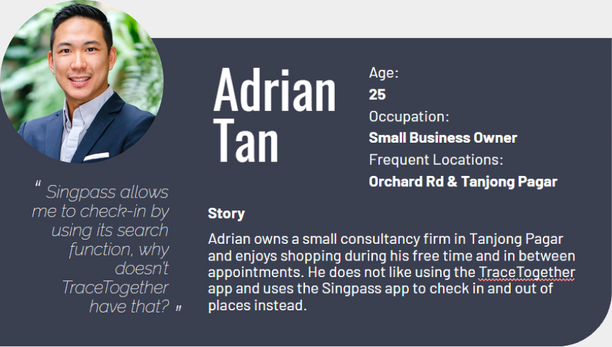
Solution 1
Enable Adrian to manually search for places to check-in as long as they are within 100 metres, and allow him check-out multiple entries at once.

Solution 2
Enable Bok Seng to customise senior-friendly interfaces for himself, with guided steps in the TraceTogether app.

Solution 3
Provides instruction on new features or improvement and make it more visible to the users at the same time.
Below are our individual initial sketches of the home page, each of us pitched on our ideas and eventually we decided on our final design based on the needs of the interviewees and survey outcomes, which we further developed on.

If you are one of the goldfish, would you like to be in the top or bottom tank?
Based on our user interviews, some users still feel that there’s quite a lot to look at on the home page, especially for the older folks. The bottom screen is the revamped home page for the app.

Below is what a person with colour blindness will see before and after revamp for the primary button colours. After running the colour blindness testing, we selected the listed purple (#502d95) under Gov Tech design guide as the primary button colour.

We strategically placed the 3 most important buttons, on the best possible areas for most users, creating human-friendly experiences and getting fewer headaches.

We recruited 10 people to test the prototype. The participants were aged between 25 - 53yrs, 8 of them are using TraceTogether app daily. Each of them was given 3 tasks to do on the prototype.
The objective of the test was :
- How easily users are able to go through the 3 tasks given
- What's the users favourite feature
- How does the overall experience feel like compare to current app
- What improvements need to be made
- Would they use this revamp TraceTogether
One of the task given during our usability test :
Users should find a way to customise the buttons on the home screen to leave only the Scan QR feature.
Outcomes :
Below are a few keys take away from these interviews, we also made a few improvements to our prototype based on their feedbacks.
90%
100% Error-free rate
80%
Feel that it is a smooth and easy experience
100%
Think that the revamp app is better than the current TraceTogether app
100%
Like the customization feature


Solution 1
(For Adrain Tan)
Enable Adrian to manually search for places to check in as long as they are within 100 metres, and allow him to check out multiple entries at once.

Manually search for location

Location will appear in below list if within 100 meters

Search and check in easily, like SingPass app

Showing full list of locations that have yet to check out

Ability to select multiple locations to check out

Check out multiple locations at once

Solution 2
(For Bok Seng)
Enable Bok Seng to customise senior-friendly interfaces for himself, with guided steps in the TraceTogether app.

Bok Seng has option to keep the default 3 buttons

Or choose 2 out of the 3 buttons

Or just retain "Scan QR" button, to make it very accessible for Bok Seng

A senior-friendly interface is now possible

Each button's function is clearly explained

Select minus (-) to hide buttons

Select plus (+) to add back button

Solution 3
(For Jackie Sim)
Provide onboarding instruction on new features to help Jackie gets the most out of the app.

Jackie does not need to scan QR code any more, just search location and check in

Slide up to check out multiple locations at once

Customisation options in More page